Poster Designing: The Ultimate Guide
All you need to know about poster designing: How to make an eye-catching Poster in 2021
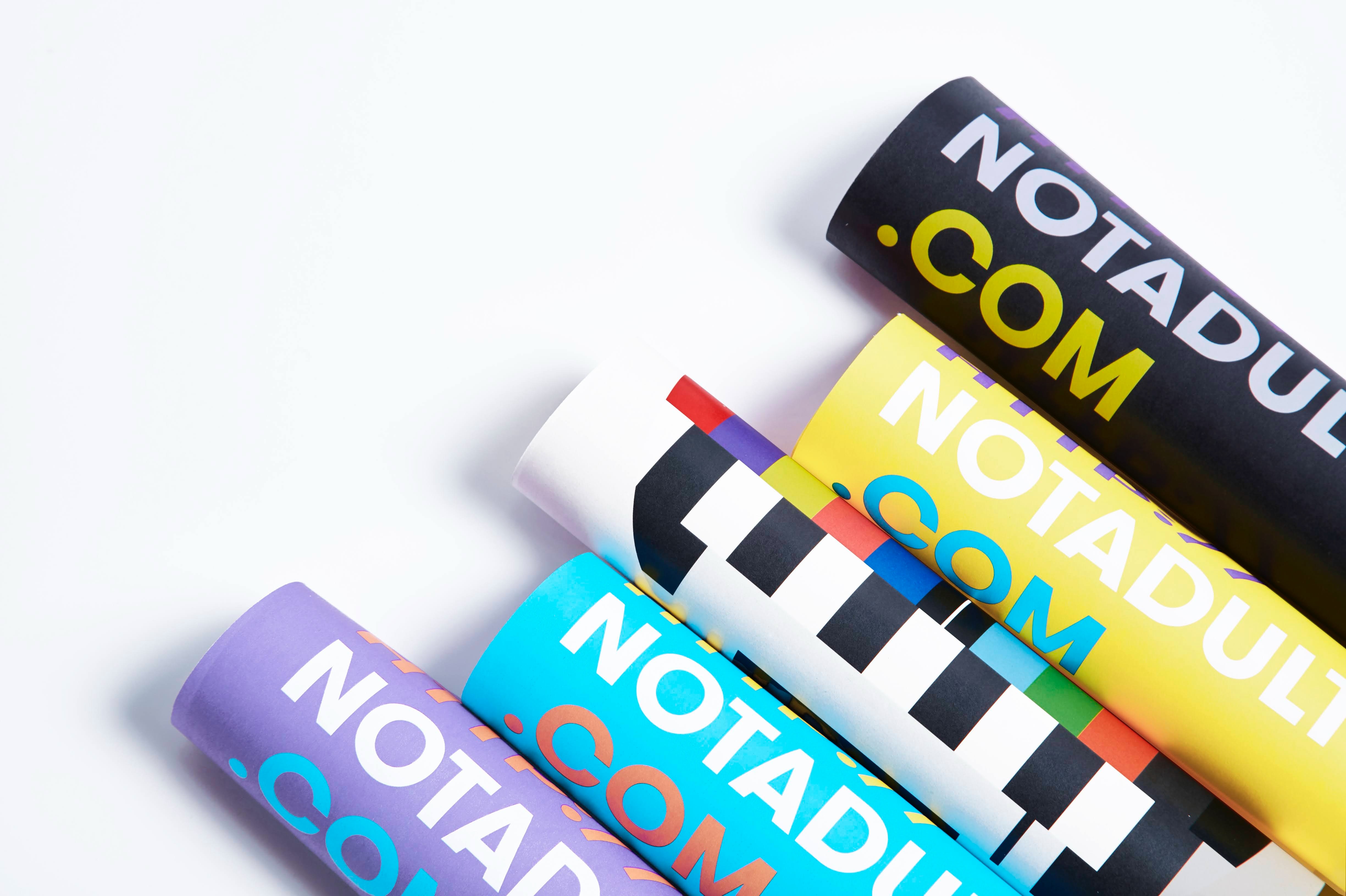
Posters are one of the oldest & most used types of marketing collateral. Posters are an effective way to draw attention to your events, fundraisers, sales and much more.
There are many ways of designing a poster. So here we are with the ultimate, most effective poster design guide. Hang along if you want to learn how to design a poster from scratch.
These poster design tips can be applied to any type of poster you design. So let’s get straight into it!
Identify the goal of your poster
First thing you need to do is identify Goal of your poster. Inform someone about a new product? Marketing an event? Or just telling people about the new sale coming up? All these goals will help you in having clear idea of what you want.
Having a clear goal from the beginning, can help you guide your design throughout the process.
Consider your target audience
Next up is identifying your target audience. Considering who you are trying to reach with your poster. Target audience will open a lot of design choices.
So make sure you have decided who you’re aiming for, before jumping into the poster design process.
Decide where you want to share your poster
One last step before jumping into design process, is to think about where it is going to be displayed/shared.
Are you going to print & frame it out and stick it up as billboards? Or just share it over social media?
It’s important to decide where you want your poster to be displayed before jumping onto the design part. Because you will be optimising your poster for print and social media differently.
Having an clear idea of where you’re going to share your poster, can help you make some pre-design decisions.
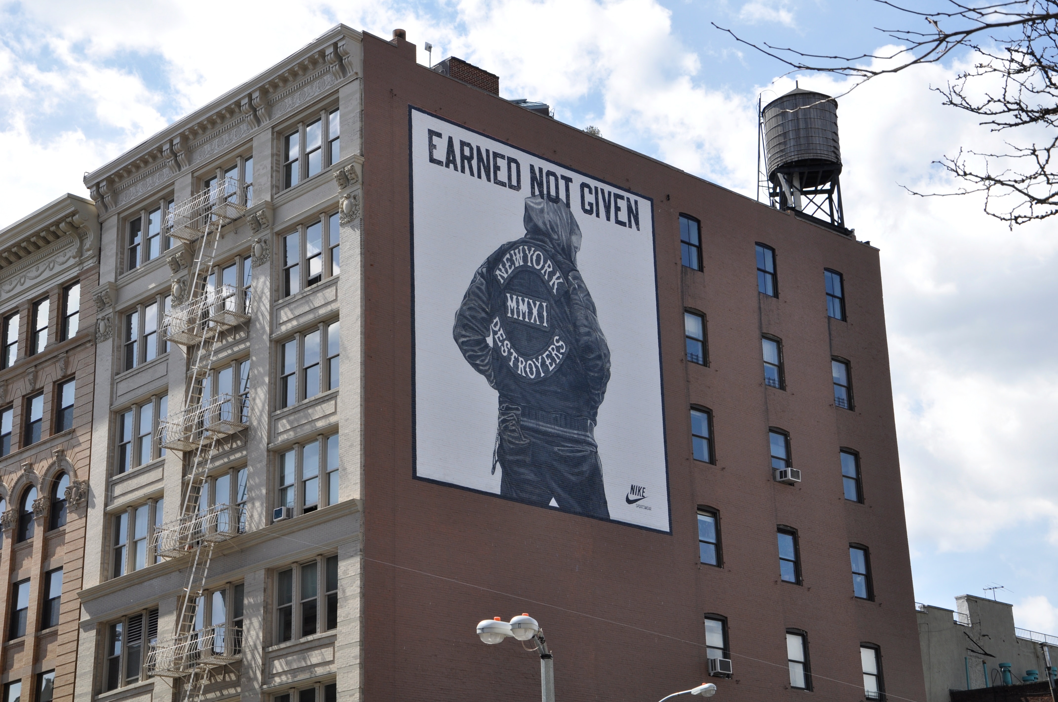
Design for Print
Once you’ve decided where you’re going to pin it. These are few guidelines to keep in mind before you move onto the printing part.
If it’s going on plain wall, print it in small or regular size and pin a bunch of them. And if it’s going on a wall with bunch of other posters, print it in a large size that will make it stand out.
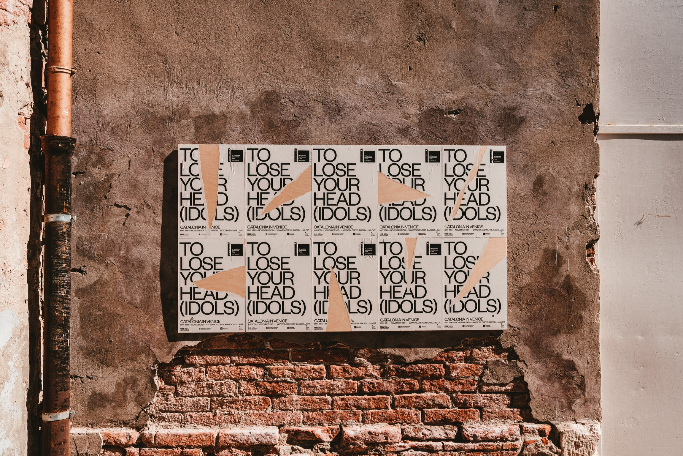
Selecting a standard paper size will make it much easier for printing, specially when you’re making multiple drafts & designs. You can also print it by yourself at home.
Bleeds
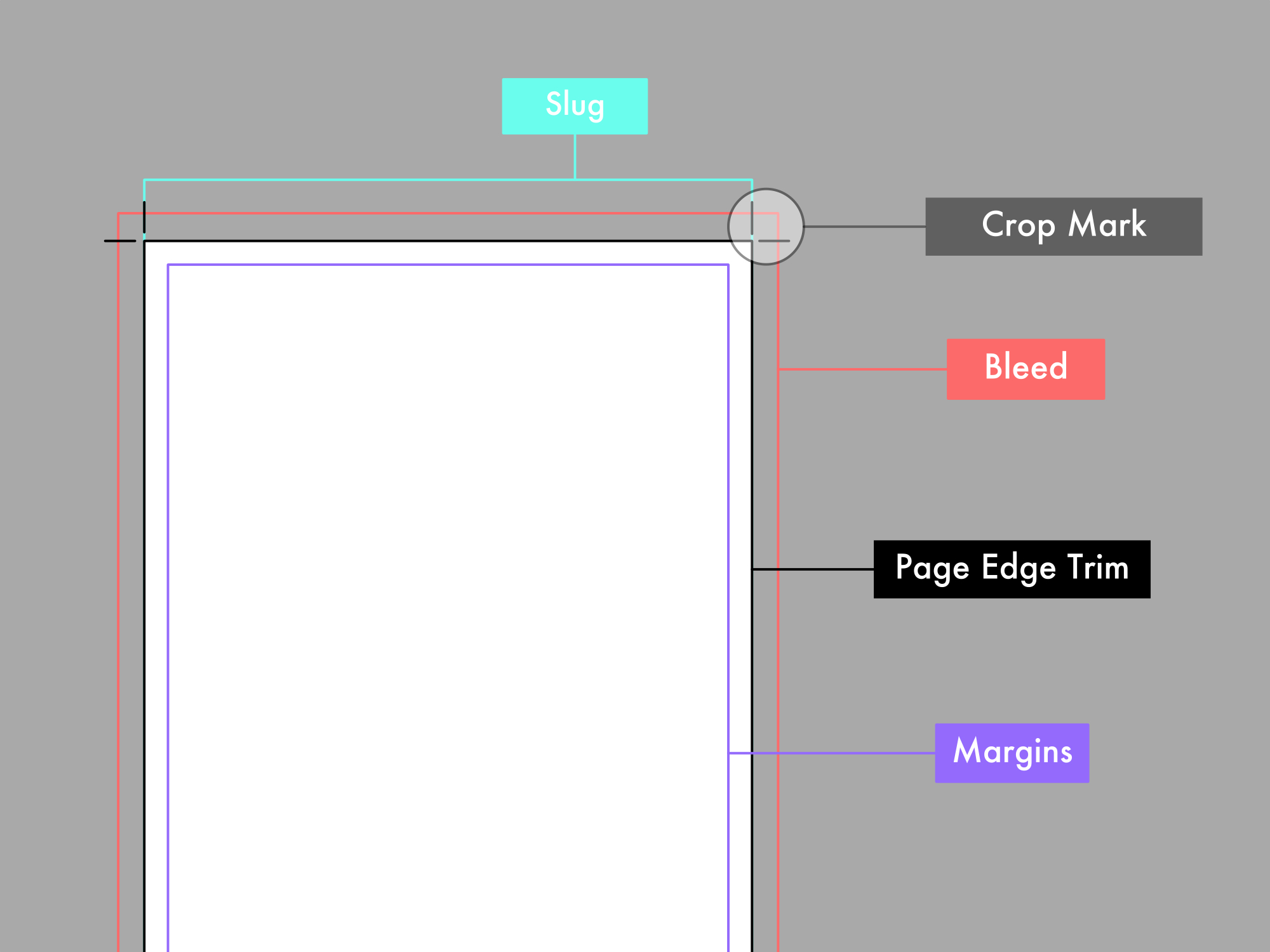
Adding bleeds should be the first step when designing your printing files. With bleeds you can obtain a better printing product, without a thin white line around its edges due to the inevitable margin error of the trimming process in a print shop.
3mm bleeds on each side is recommended. You can add margins of 3 to 5 mm to your file in order to help you visualise this area. The margins extend from the safe zone to the edges of your printing posters.
Design for Social Media
Designing poster for social media is a bit different from print design. It comes with great opportunity play around with different styles and sizes. Here are some guidelines to follow.
Making your poster look good on social media, you may have to make couple of variations of poster for different media platforms.
These are the ideal dimensions for each of the big social media platforms:
| 1200x628 or 1200x1200 for square | |
| 1024x512 | |
| 1080x1080 or 1080x1350 for portrait | |
| Try to use ratio of 2:3 to 1:3.5 |
If you’re promoting your event on Twitter or Facebook, banners generally fit better on their newsfeeds. In that case, landscape orientation is fine.
Create a Mood board
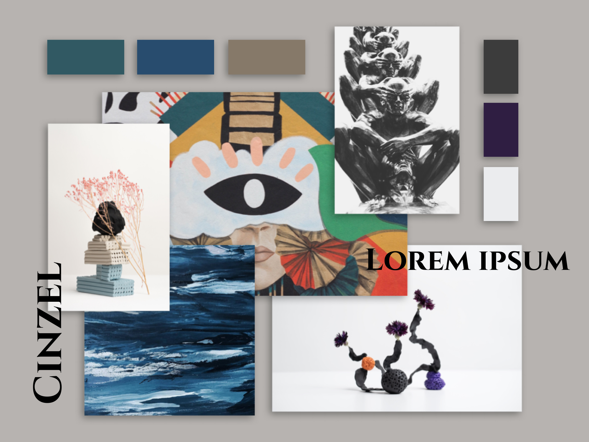
Finding inspiration for poster design. Organising it and turning that inspiration into a base for creating a design that stands out.
Mood boards are combination of physical or digital collages that arrange images, materials, text, and other design elements into a format that represents final design style.
Picking color scheme
The first thing that someone is probably going to notice in your poster is the color scheme. Mostly you’ll end up with a good color scheme but if you’re having hard time selecting a color scheme. You can always lookup on internet for inspiration.
If your designing poster for a company, then you can incorporate company’s brand colors into your poster design.
However, if you’re still struggling to come up with a relevant color scheme, take a look at the meanings and emotions of each color.
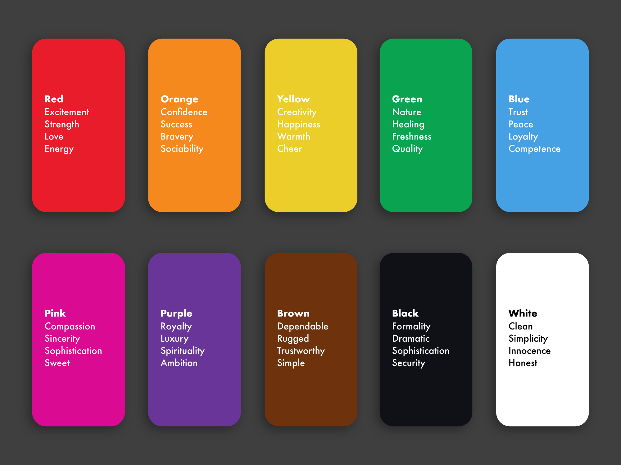
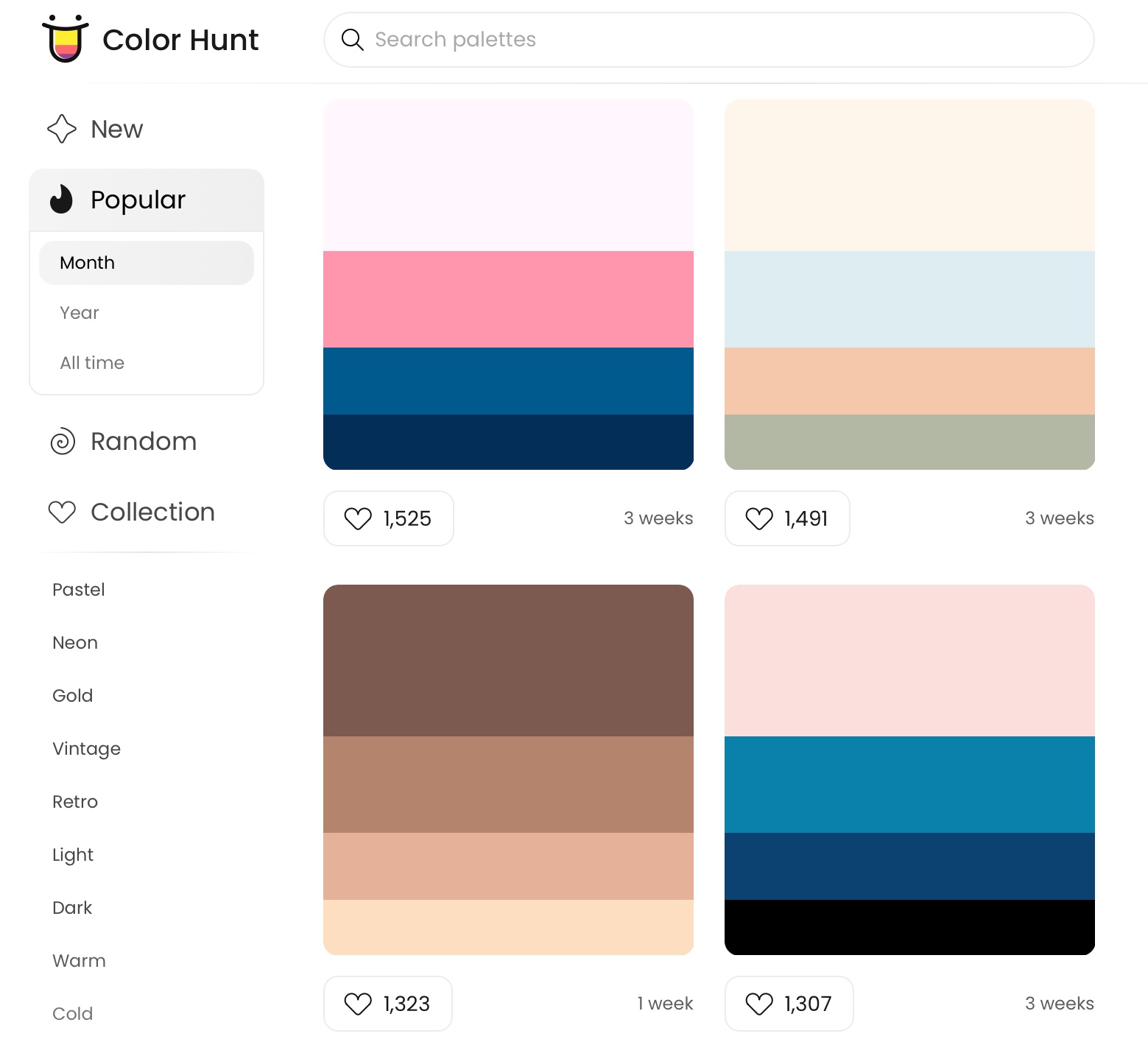
Color theory can help you pick the right color palette in no time. Now if you’re not sure where to start when it comes to pairing colors, a color scheme generating tool like Colorhunt can be helpful.
Include a clear CTA (Call to Action)
The goal of every poster is to expose people to something. Mostly inviting someone to something, such as a concert or movie or any other event.
The moment you grab someone’s attention, they should know what their next step should be. That is known as a CTA (Call-To-Action).
Each and every poster should have a CTA, no matter what the topic or the type of poster it is. Otherwise there is no point in creating the poster.
Contrast
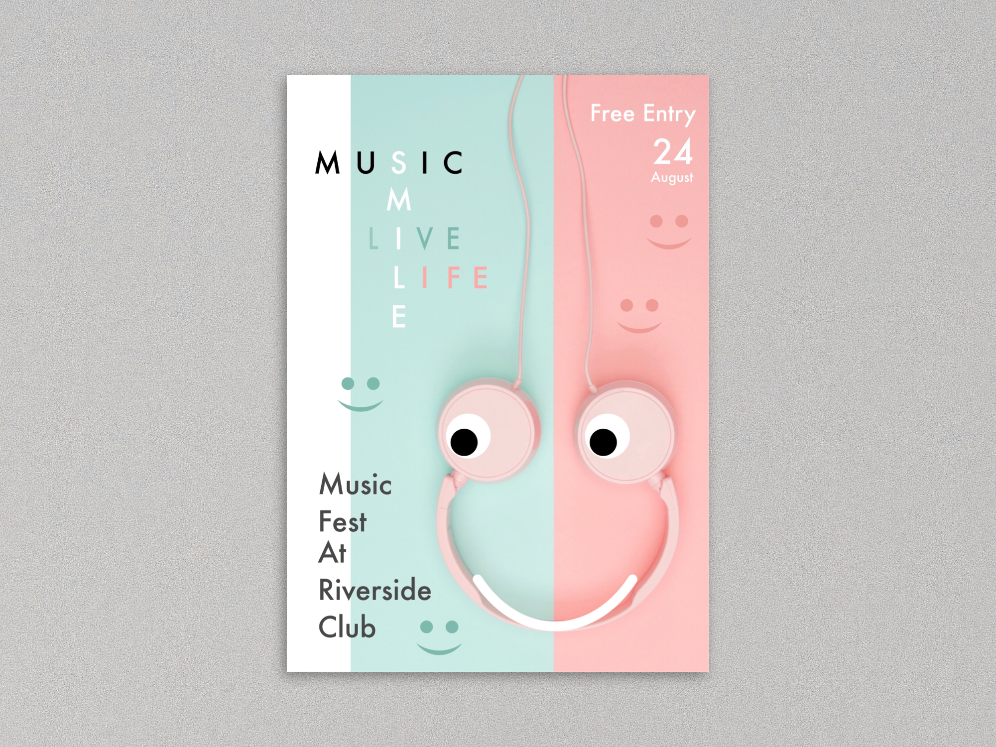
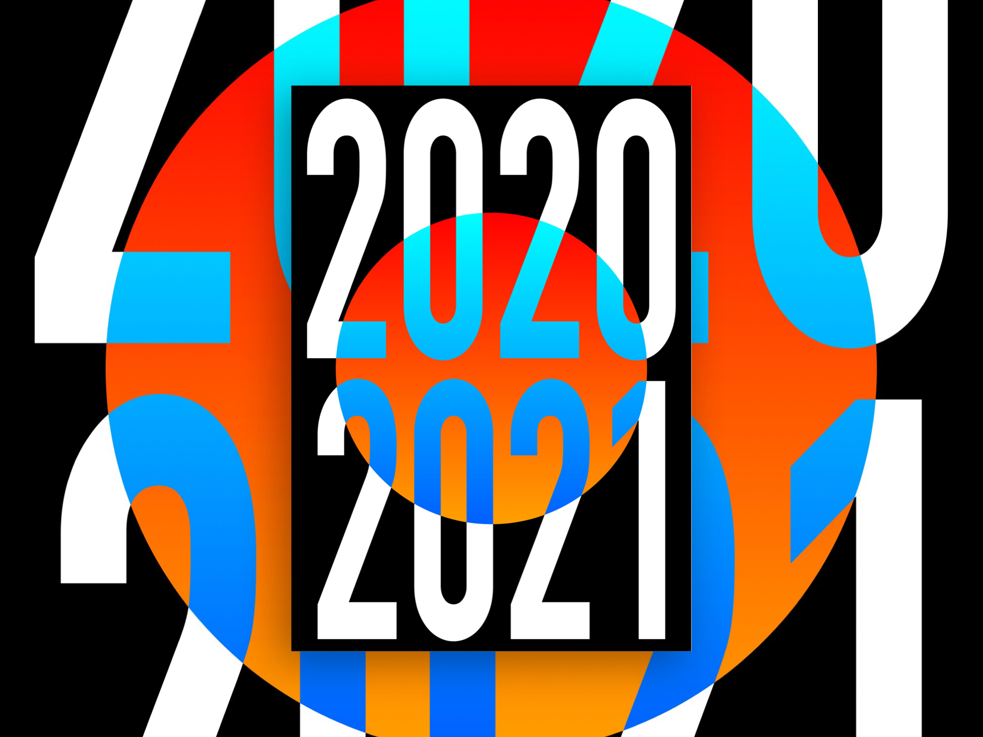
You just have few seconds to grab someone’s attention with a poster. High contrast between design elements can help you do that. Experiment with bold typefaces & colour palettes.
You can also use light & dark colours. black and white creates an ultimate contrast. You can also try dark text against a light background or the other way around.
Typography
Typography is another key element that can make your poster look outstanding. Some of the best posters are made with type and color, with no images or illustrations.
Typography can add some personality to designs especailly when you design a custom logos and brand identity.
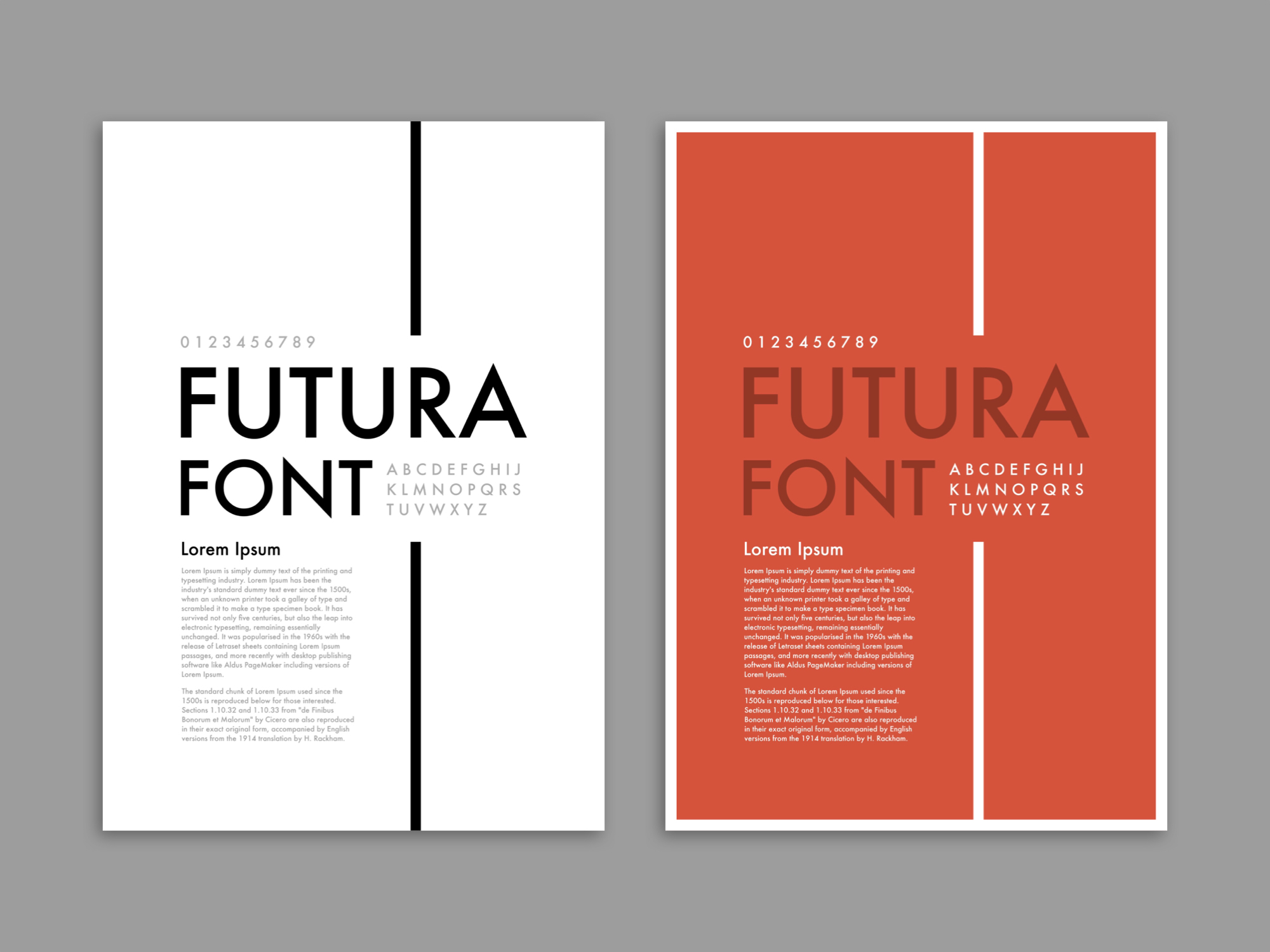
Here are some typography principles to keep in mind. Try not to use more than two fonts in a design instead experiment with bolder, wider, bigger typefaces. Use the typeface that appropriately represents the mood of the event.
Use of space
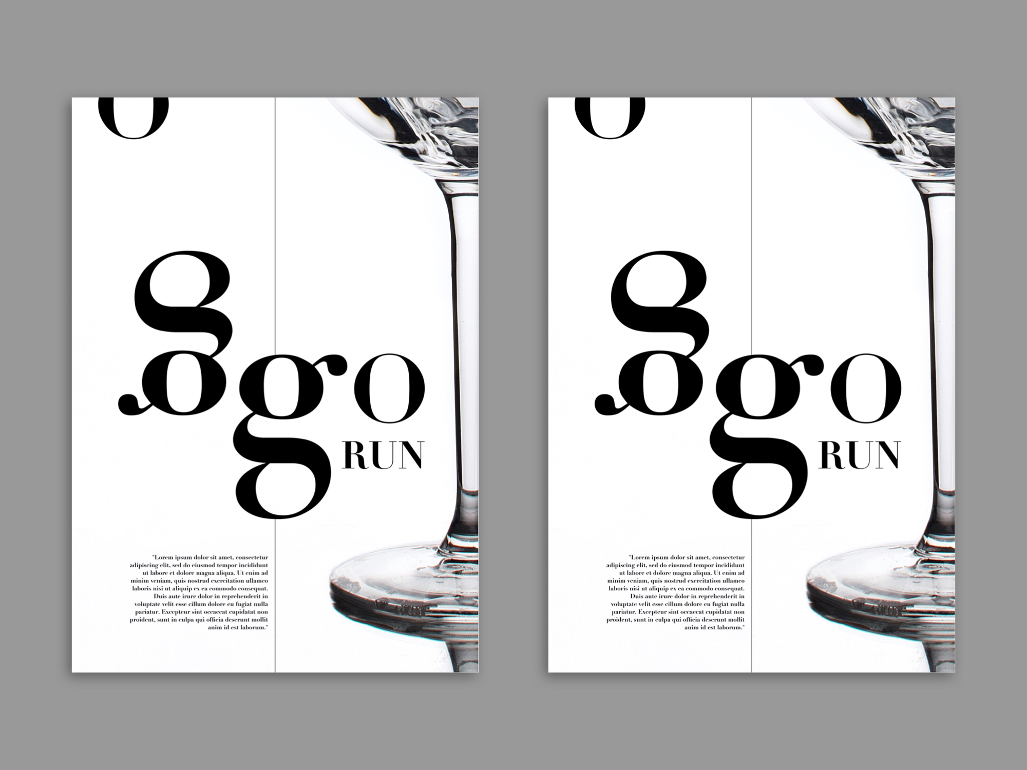
Space is an important element in graphic design. And when it comes to posters, use of space even more important because most of the people will be looking at it from a distance. Adding extra space will dramatically increase the visual impact and readability.
Adding space between letters, lines, shapes, images and text can make it even more pleasing and eye catching.
Always use high-quality images & stock images
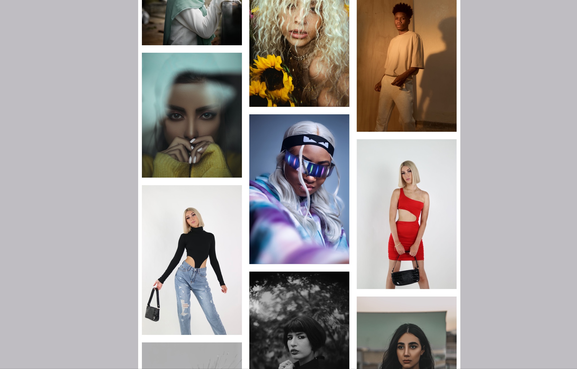
As we all know a picture is worth a thousand words. So why not use it? People mainly prefer looking at pretty images than reading a whole lot of text. Adding images and visuals to your poster will automatically do the 90% of wonder work. But make sure the images you use are high quality, so that it doesn’t get pixelated or blur while printing.
Downloading from google images is a bad idea. Specially when you are creating a poster for commercial use. Picking up images from random sources can be troublesome due to copyrights.
Downloading royalty free & high quality images from stock image websites like Unsplash & Pexels is a great idea.
Printing techniques
Consider looking at different printing techniques for your poster. Depending on the location and audience for your poster. You can try printing techniques like Screen printing, Letterpress, UV layer or foiling that can turn your poster into a masterpiece.
Designers use these printing techniques for high-end projects & events with a certain level of prestige.
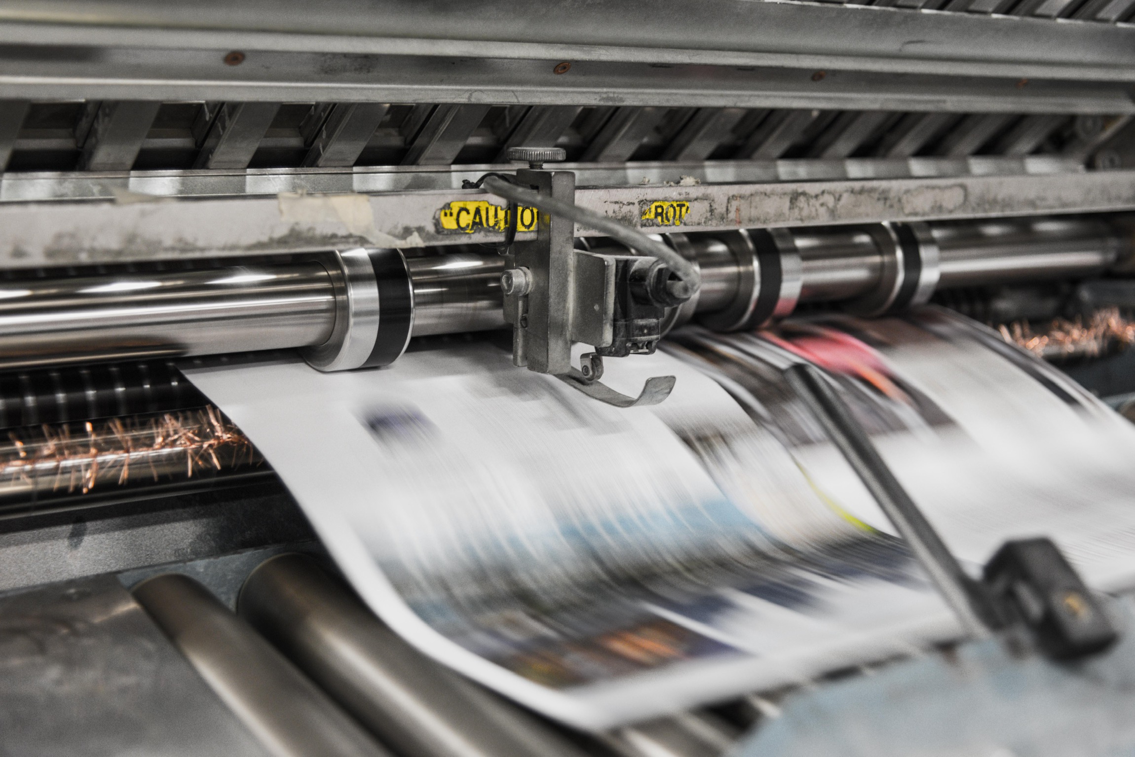
Even if you’re planning on printing it for a regular print. You need to figure out which print materials are going to work best for your poster and your budget.
Things you’ll have to choose include:
- Poster size
- What kind of paper to use (card stock, cardboard, paper, etc.)
- What paper weight
- The finishing of the poster (matte, semi-gloss, glossy, etc)
Hopefully, this guide will help you start creating your unique poster in no time. You now have everything you need to design a poster. So get out there and start designing!